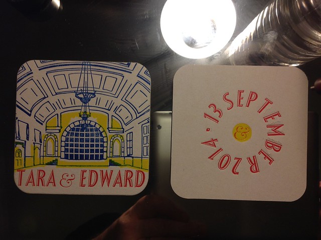
My good friends Ed and Tara got married, and I made these for their wedding; art by the marvellous Kate Lyons who's a tremendous graphic designer and a better printer than I am, to boot. Oh well. The ampersand on the text-only side is a little typography joke: it's always a good thing for a wedding, with it signifying joining and also more to come; the fact that "&" is a typographical joining of the letters E and T (to spell the French "et" obviously) made it irresistible for the wedding of T to E, if you see what I mean. These were part of the place settings at the reception and most seemed to have been pocketed as souvenirs by the end of the event.

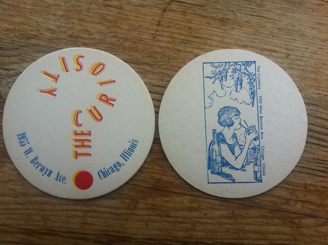
The Curiosity is not a bar, it's the home of some friends of ours. This was a thank-you for letting us stay the night. The image is a vintage block I found on eBay.
Lining up a three-colour print on circular paper is murderously difficult. That's what I learned.

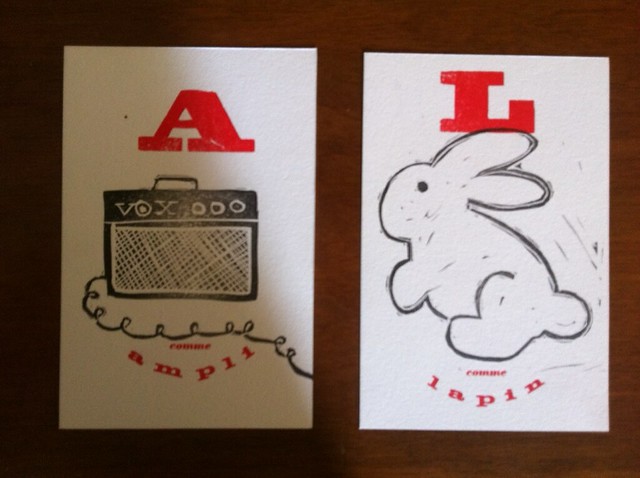
Where is English we would say "A is for Apple, B is for Book..." apparently in French it's "A comme Animaux, B comme bier..." and so on. As Christmas presents for our little friends Ava (who is somewhat punk rock) and Lulu (who tells us she is is part rabbit) we made these postcard-sized gifts. The images are linocuts by Jenn (my wife), and then I added the words on the press.
Three typefaces seems rather a lot for a print job involving 11 letters. These are all about the linocuts, though.
You may have noticed that I have learned how to set type in a circle! I don't have fancy typesetting equipment to manage this: I use bottle lids and masking tape. And luck. But once you know how, it's hard not to.